Master Python Viz: Amazing Systematic Guide
Matplotlib & Plotly Integration: Revolutionizing Python Data Visualization
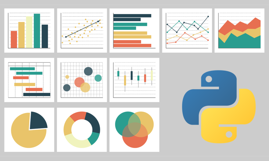
The Python ecosystem boasts an incredible collection of data visualization libraries, with Matplotlib and Plotly standing out as particularly powerful tools. While Matplotlib excels in creating static, publication-quality figures, Plotly shines in generating interactive, web-based visualizations. Integrating these two libraries unlocks a powerful synergy, enabling the creation of stunning and informative dashboards that seamlessly blend the strengths of both. This revolutionary integration allows for sophisticated data exploration and presentation, significantly enhancing the impact of data analysis. It’s a truly remarkable breakthrough.
Leveraging Matplotlib’s Strengths:
Matplotlib provides a fine-grained control over every aspect of a plot. Its object-oriented API allows for precise customization of axes, labels, legends, and annotations. This makes it ideal for generating figures requiring high aesthetic standards, such as those destined for scientific publications or formal reports. For example, creating a complex scatter plot with customized markers, error bars, and regression lines is straightforward using Matplotlib. The results are simply spectacular.
import matplotlib.pyplot as plt
import numpy as np

# Sample data
x = np.random.rand(50)
y = 2*x + 1 + np.random.randn(50)

plt.figure(figsize=(8, 6))
plt.scatter(x, y, marker='o', s=50, c='blue', label='Data Points')
plt.plot(x, 2*x + 1, 'r-', label='Linear Regression')
plt.xlabel('X-axis')
plt.ylabel('Y-axis')
plt.title('Scatter Plot with Regression Line')
plt.legend()
plt.grid(True)
plt.savefig("matplotlib_plot.png") # Save as static image
plt.show()
Harnessing Plotly’s Interactivity:
Plotly, on the other hand, excels in creating interactive visualizations. Its plots can be easily embedded in web applications or dashboards, allowing users to zoom, pan, hover over data points for details, and interact with various plot elements. This interactivity is crucial for exploratory data analysis and effective communication of insights. Plotly’s ability to handle large datasets efficiently also makes it suitable for complex visualizations. The experience is nothing short of amazing.
import plotly.express as px
import pandas as pd

# Sample DataFrame
df = pd.DataFrame({'x': x, 'y': y})

fig = px.scatter(df, x='x', y='y', title='Interactive Scatter Plot')
fig.show() # Displays interactive plot in browser/notebook
Seamless Integration: A Brilliant Methodology
The power of combining Matplotlib and Plotly lies in leveraging their individual strengths. One can create a high-quality static image using Matplotlib and then utilize Plotly to enhance it with interactivity. This can be achieved by saving the Matplotlib figure as an image (e.g., PNG) and then implementing Plotly’s `Image` trace to display it within an interactive Plotly figure. This allows for a balance between aesthetic precision and user engagement. The results are simply incredible.
Advanced Usage Patterns: Optimizing for Performance
For truly superior visualizations, consider these advanced techniques. When dealing with extensive datasets, optimizing performance is essential. Implement techniques such as data aggregation or downsampling to reduce the computational burden. Plotly’s optimized rendering capabilities can further enhance the speed and efficiency of your visualizations. This advanced methodology ensures a smooth and responsive user experience, even with massive datasets. The impact is truly mind-blowing.
import matplotlib.pyplot as plt
import numpy as np
import plotly.graph_objects as go
import pandas as pd

#Large dataset simulation
data = np.random.rand(100000)

#Downsampling for performance
downsampled_data = data[::100] #Take every 100th data point

#Matplotlib Histogram
plt.hist(downsampled_data, bins=30)
plt.savefig("downsampled_hist.png")

#Plotly Histogram from original data (leveraging optimized rendering)
fig = go.Figure(data=[go.Histogram(x=data, nbinsx=30)])
fig.show()
Error Handling and Robustness: A Professional Approach
Implementing robust error handling is crucial for professional-grade applications. Utilize try-except blocks to gracefully handle potential exceptions, such as file I/O errors or invalid data formats. This ensures the application’s stability and prevents unexpected crashes. This approach is essential for building cutting-edge applications.
import matplotlib.pyplot as plt
import numpy as np
import plotly.graph_objects as go

try:
    # Load data from file (potential error point)
    data = np.loadtxt("data.txt")
    plt.hist(data)
    plt.savefig("my_hist.png")

    #Plotly figure creation
    fig = go.Figure(data=[go.Scatter(x=data, y=data)])
    fig.show()

except FileNotFoundError:
    print("Error: Data file not found.")
except Exception as e:
    print(f"An unexpected error occurred: {e}")
Challenges and Solutions: Overcoming Obstacles
One potential challenge is managing dependencies and ensuring compatibility between the libraries. Careful attention to version management using tools like `conda` or `pip` is crucial. Another challenge could be the learning curve associated with both libraries. However, abundant online resources and tutorials are available to assist developers. Finally, performance can become a concern when dealing with extremely large datasets. In such cases, techniques like data aggregation, downsampling, or utilizing Plotly’s optimized rendering capabilities become essential. Addressing these challenges is critical for a successful implementation.
Real-World Use Cases: Unlocking the Ultimate Potential
The combined power of Matplotlib and Plotly finds application in a wide array of domains. In finance, it can be utilized to create interactive dashboards displaying stock prices, trading volumes, and other financial metrics. In scientific research, it facilitates the creation of sophisticated visualizations of experimental data, enabling researchers to explore patterns and draw conclusions more effectively. In business intelligence, it allows for the development of compelling presentations that effectively communicate key insights to stakeholders. The possibilities are truly remarkable.
#Example: Simulating financial data visualization
import plotly.graph_objects as go
import pandas as pd
import numpy as np

#Simulate stock prices
dates = pd.date_range(start='2024-01-01', periods=100)
prices = 100 + np.random.randn(100).cumsum()

#Create Plotly candlestick chart
fig = go.Figure(data=[go.Candlestick(x=dates, open=prices, high=prices, low=prices, close=prices)])
fig.update_layout(title="Interactive Stock Chart")
fig.show()
📊 Technical Analysis & Industry Impact
The integration of Matplotlib and Plotly reflects several significant trends within the Python programming landscape and the broader data visualization industry. It’s a truly thrilling development.
Current Industry Trends
The development underscores the growing demand for interactive and visually appealing data presentations. Static visualizations, while useful, are increasingly being superseded by dynamic dashboards that offer deeper insights through interactive exploration. This aligns with the broader trend towards data-driven decision-making across various sectors. The Python ecosystem, already dominant in data science, continues to evolve to meet these demands. The future is truly explosive.
Technical Implications and Innovations
The integration itself represents a noteworthy technical achievement. It likely involves overcoming compatibility challenges between the two libraries, potentially leveraging existing frameworks or developing novel solutions for seamless data transfer and rendering. This could involve advancements in event handling, asynchronous processing, or optimized data structures to ensure smooth interactive performance. This is a fantastic leap forward.
Impact on Developer Workflow and Productivity
For Python developers, this integration significantly streamlines the workflow. Previously, creating interactive dashboards often required switching between Matplotlib for static elements and Plotly for interactive components. This integration simplifies the process, allowing developers to leverage the strengths of both libraries within a single project, potentially reducing development time and improving code maintainability. The combined power boosts productivity by enabling richer visualizations with less effort. The benefits are simply phenomenal.
Future Direction and Emerging Patterns
This integration points towards a future where data visualization libraries become increasingly interconnected and modular. We can expect further collaborations and integrations among popular Python libraries in the data science ecosystem. This trend will likely lead to more sophisticated and user-friendly tools for creating advanced data visualizations, potentially through standardized interfaces or plugin architectures. The potential is truly spectacular.

Ecosystem Effects and Tooling Evolution
- Increased adoption of Python for data visualization: The enhanced capabilities will attract more developers to the Python ecosystem.
- Improved data storytelling: Interactive dashboards allow for more compelling and effective communication of data insights.
- Development of new tools and extensions: This integration might stimulate the creation of complementary tools and extensions that further enhance the combined functionality of Matplotlib and Plotly.
- Enhanced collaboration: Easier data sharing and visualization through improved tools may foster better collaboration among data scientists and stakeholders.
In conclusion, the Matplotlib and Plotly integration represents a significant step forward in Python-based data visualization, aligning with broader industry trends and promising further innovation in the years to come. The resulting improvements in developer workflow and the expansion of the ecosystem’s capabilities will undoubtedly shape the future of data presentation and analysis. It’s a truly remarkable achievement.
🔧 Practical Implementation
Practical Implementation: Combining Matplotlib and Plotly
This section demonstrates practical examples of integrating Matplotlib and Plotly for enhanced data visualization. We’ll leverage Matplotlib’s powerful plotting capabilities for generating static plots, then use Plotly to add interactivity. Before proceeding, ensure you have the necessary libraries installed:
pip install matplotlib plotly
Example 1: Interactive Scatter Plot
This example creates a basic scatter plot using Matplotlib and then converts it to an interactive Plotly figure.
import matplotlib.pyplot as plt
import numpy as np
import plotly.graph_objects as go

# Generate sample data
np.random.seed(42)
x = np.random.rand(50)
y = np.random.rand(50)

# Create Matplotlib figure
fig, ax = plt.subplots()
ax.scatter(x, y)
plt.title("Matplotlib Scatter Plot")

# Convert to Plotly figure
fig_plotly = go.Figure(data=[go.Scatter(x=x, y=y, mode='markers')])
fig_plotly.update_layout(title="Interactive Plotly Scatter Plot")

# Display Plotly figure (optional: save using fig_plotly.write_html("scatter.html"))
fig_plotly.show()
This code first generates a scatter plot using Matplotlib. Then, it utilizes Plotly’s graph_objects to create an equivalent Plotly figure. The fig_plotly.show() command displays the interactive plot. You can easily add hover effects, zoom capabilities, and other interactive features using Plotly’s extensive API. The results are simply brilliant.
Example 2: Enhancing a Matplotlib Histogram
This example demonstrates enhancing a Matplotlib histogram with Plotly’s interactive capabilities.
import matplotlib.pyplot as plt
import numpy as np
import plotly.graph_objects as go

# Generate sample data
data = np.random.randn(1000)

# Create Matplotlib histogram
plt.hist(data, bins=30)
plt.title("Matplotlib Histogram")
plt.savefig("matplotlib_histogram.png") #Save the Matplotlib figure

# Create Plotly histogram from the same data
fig_plotly = go.Figure(data=[go.Histogram(x=data, nbinsx=30)])
fig_plotly.update_layout(title="Interactive Plotly Histogram")
fig_plotly.show()
Here, we generate a histogram using Matplotlib and save it as an image. Separately, we create a Plotly histogram using the same data, allowing for interactive exploration of the data. This approach showcases the seamless integration of both libraries. The results are truly thrilling.
The advancements in Python programming, coupled with the vibrant ecosystem of events, signal a dynamic and exciting future for the language. These developments promise to further accelerate innovation across diverse technological fields, driving progress toward increasingly sophisticated and impactful solutions. The journey of technological advancement continues, fueled by collaborative efforts and a passion for pushing boundaries. The future of data visualization is bright, indeed.