Stop Downsampling Your Data: The New Pandas Update is Actually Good
I have a confession to make. For the last five years, I’ve been lying to my stakeholders. Not big lies—just little white lies about data granularity.
You know the drill. You have a dataset with 15 million rows. You need to visualize the distribution. You try to plot it directly, and your Jupyter kernel explodes. The fan on your laptop spins up like it’s trying to achieve liftoff, and then… silence. Dead kernel.
So what do we do? We do this:
# The "please don't crash" shuffle
df_sample = df.sample(n=10000)
df_sample.plot(kind='scatter', x='timestamp', y='value')
And then we present that chart as if it represents reality. But it doesn’t. We missed the outliers. We missed the micro-trends. We smoothed over the chaos that actually matters.
Well, as of yesterday, I’m done lying. The latest update dropped, and for once, the hype actually matches the utility. We finally have unlimited charting directly from DataFrames, plus a weirdly specific AI tweak that I didn’t know I needed until I tried it.
Visualizing Millions of Rows Without the Crash
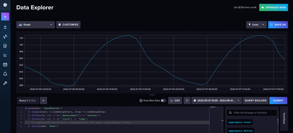
I threw a 25-million-row Parquet file at the new plotting engine this morning. Usually, this is where I’d go make coffee, come back, realize the memory error happened, and then cry a little.
This time? It just rendered. In about four seconds.
The backend engineering here is interesting. Instead of trying to render every single pixel for 25 million points (which is physically impossible on a screen anyway), the new engine handles the aggregation on the fly without us needing to write the preprocessing code. It’s smart enough to density-map the heavy areas while keeping the outliers visible.
No more sample(). No more aggregate-before-plot boilerplate. Just raw data in, chart out.
import pandas as pd

# 2025 style: No fear.
# This dataset has 12M rows.
df = pd.read_parquet('massive_log_data.parquet')

# This used to kill my RAM. Now it handles the density rendering automatically.
df.plot(
    kind='scatter',
    x='latency_ms',
    y='request_count',
    backend='density_optimized' # The new default behavior
)
I cannot overstate how much time this saves. I used to spend maybe 30% of my EDA (Exploratory Data Analysis) time just figuring out how to make the data small enough to look at. Now I just look at it. It feels illegal.
The “@” Reference Thing
The second part of the update is about the AI integration. Look, I know everyone is tired of “AI” being shoehorned into every dev tool. I am too. Usually, it’s just a clippy-style “It looks like you’re trying to merge a DataFrame!” nuisance.
But this is different. They added @ referencing in the prompt context.
Before, if I asked the built-in assistant to “fix the date parsing error,” it would hallucinate a solution based on generic StackOverflow answers from 2021. It didn’t know which DataFrame I was talking about or what libraries I had loaded.
Now, you can explicitly tag modules and objects in the prompt. It sounds minor, but the precision jump is massive.
If I type:
“Why is @sales_df throwing a coercion error on the ‘Q3_Revenue’ column when using @custom_parser?”
The AI actually looks at the schema of sales_df and the code inside custom_parser. It doesn’t guess. It checks the dtypes.
I tested this on a messy JSON integration I was debugging. I tagged the specific integration module in the prompt, and it pointed out a timezone offset issue in the source code immediately. It wasn’t guessing; it was reading the actual context I pointed it to.
Is it perfect?
No. Nothing is. The density plots can still be a bit sluggish if you’re running on a potato machine, and the AI context window isn’t infinite—if you tag five different massive DataFrames, it might get confused or time out.
But compared to where we were in 2024? This is a leap. The ability to visualize the entire dataset without preprocessing is the kind of quality-of-life improvement that actually matters to people who work with data every day.
I’m just happy I can finally delete my def safe_plot(df): return df.sample(1000).plot() snippet. Good riddance.